Quite a lot has happened since I last posted…
And when I say a lot, I mean A LOT!
I mean, it has been roughly a month since I last posted so I think the above statement is incredibly accurate.
And so you may therefore be wondering what caused this temporary blogging hiatus.
Well, I won’t lie, it was because of a volatile mix of stress, nerves and anxiety.
In the build-up to the December 13th deadline, I was essentially living under a rock. All of my time, focus and attention was focused on the completion of this project. I was simply oblivious to everything else that was happening around me as I was essentially consumed by this project.
Because of this, I was simply not in the right frame of mind to post regular updates on this blog because my mind was focused on more important matters.
You know… the matter of stressing out and losing my mind.
However, the December 13th deadline has already come and gone and I have simply spent the last several days trying to recover and recuperate from the nerves and anxiety of having to present my final Interim Viva. Now that I have sufficiently rested, I feel like that I am in the right frame of mind to thoroughly explain what has been happening over the last several weeks or so. There are many gaps to fill so it’s about time that I flex my typing fingers once again and explain (almost) everything.
A thorough breakdown of how the final Interim Viva on December 13th will be presented on the next post as the purpose of this post is to simply detail what work was completed up to that point.
Let me cast my mind back to the Weekly Tutorial of November 29th (Wow… That was ages ago…)
Long story short, it was a complete and total dud. The more I forget about it, the better.
I do not wish to bore you with all of the details but quite simply, the week leading up to that tutorial was the worst week I had so far this academic year in regards to levels of productivity and amount of work completed. Mentally and emotionally speaking, my mind was all over the place and I just did not feel right. The work that I had completed (or lack of) reflected this. I refuse to display that work here because:
- There is not a lot of it. Honestly, there isn’t.
- The quality of the work in question does not necessarily match my own personal standards.
- It did not have a significant or meaningful impact on the direction of this project.
Everyone has their bad days and it just so happened that this particular week was full of them.
Since this was so close to the deadline, I was worried.
I was anxious.
I do not know what exactly triggered these feelings and I feared that this slip-up, as well as the way I was feeling, would severely affect my confidence and productivity levels heading into the nitty-gritty stages of this project.
I needed to pick myself up, re-motivate myself and bounce back.
That may have sounded quite depressing but let us fast forward to the Weekly Tutorial that took place on December 6th.
Before I begin to discuss the work that was completed for this tutorial, you can view my presentation below:
Not everything will be detailed in this post. There is simply too much to discuss which is why I implore you to view my tutorial presentation.
.
.
.
Seen it?
Yes?
Let us continue.
It is certainly a packed presentation and I think that this body of work, and the amount of it, goes to show that I did indeed bounce back.
I knew it was a lot of work when I could tell that when I was presenting, I got the sense that I was perhaps rambling on for a bit too long. Not that this is a huge problem, I just had a lot to discuss and a lot to get off of my chest. Although, I could perhaps work on communicating myself in a more clear and concise way.
Despite there being a lot of work to discuss, I will still detail the key pieces of work that was carried out.
This is something that I arguably should have done a while back but by using various pieces of research, I identified my definitive target market. The following pieces of research were used:
- Average Salary Information – Looked at average UK salaries based on gender, years of work experience, employment status etc.
- Disposable Income – How much money people have to spend once tax has been deducted. Looked at disposable income based on region, age groups and employment status.
- Favourite Brands – Qualities and aesthetics of the target market’s favourite brands could be reflected in the final product.
- Product Style Analysis – A casual interview was carried out with the Homeware Manager of John Lewis to gauge what types of people like certain products and certain aesthetic styles.
A brief summary of the target market reflects this research:
Age: 20 – 35.
Genders: Both Male and Female.
Average income: £20,000 – £30,000
Average disposable income: £15,000 – £20,000
Lifestyle: Work or study 9 to 5. Schedule means that testing alarm is last thing on their mind. Social Media. Streaming. Prominent social life.
Issues: Aware of fire safety to an extent but they keep forgetting to test it or they are not aware that it should be tested in the first place. Little experience as they don’t know when and how it should be tested. Believe that smoke alarms are unreliable.
Ideally new house buyers who rent or buy a new property. Bargain hunter. Brands and income emphasise this. Eye for modern, affordable products. They want to make sure that their home is protected.
Having (finally) identified my target market, it felt good knowing who I was definitively designing for. This gave the project an added sense of purpose, not that the project never had a sense of purpose to begin with. It just simply provided more clarity and focus to the project.
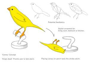
Because I had 5 main concepts, I knew that I needed high quality sketches of all of them. But I felt that my hand sketching and marker rendering skills would not do these ideas justice. That is why I decided to take the plunge and purchase a graphics tablet. Using this in conjunction with Autodesk Sketchbook made my sketches look, well, better to say the least. I believe that they look more clean and professional compared to my other hand drawn sketches. The lines are sharp, the shading adds further realism and the concepts have obviously become increasingly developed. That is my personal judgment but I will let you judge for yourself:
I am obviously not yet a pro but practice certainly makes perfect. I do not wish to blow my own trumpet but I think these sketches do look somewhat decent and that is good enough for me considering that I have not been using the graphics tablet for that long. There is always room for improvement. However, this method of sketching is definitely something that I wish to utilise more in the future.
I would explain these concepts in detail but I have probably rambled on for long enough and I feel that the sketch sheets can explain themselves.
(Regarding the ‘Origami’ concept, I initially sketched it with one base/pedestal but then I decided ‘Nah, it looks bulky’. It would accommodate the functionality of the origami flipping 180° but I wanted to sketch a new, more stylish base/pedestal.)
Concept development cannot go any further without user feedback of course. Therefore, these concepts were put forth to a focus group of sorts. The people I spoke to were part of my target market and speaking to people about these concepts proved to be really useful as I did receive incredibly useful feedback.

This is probably something that I should have done more of throughout the project but I got a decent gauge as to which concepts people liked the most and I compiled this feedback into an evaluation table of sorts. This allowed me to see how each concept stacked up to one another and it gave an idea as to which concepts were deemed to be the strongest. All 5 concepts were compared to the Thermoptek ST-622. It’s one of the cheapest smoke alarms on the market and it’s manufactured by one of the UK’s leading fire safety brands i.e. FireAngel.

The following criteria was used:
- Aesthetics – Are the aesthetics suitable for the chosen target market?
- Viability – Using today’s technology and materials, is this product a viable solution to meet the project brief? I.e. Increase awareness of fire safety.
- Affordability – Can the target market afford this product?
- Maintenance – What level of maintenance is required to make sure that this product functions at a suitable level?
- Function – Does its function align itself with the project brief? Does it increase awareness of fire safety? Does it encourage the user to test their alarm?
- Potential – Does it satisfy the project brief?
After seeing how each concept stacks up to one another using the user feedback that was received, it was decided that the 3 bird concepts were the most popular. This pretty much confirmed what I had already known for the past several weeks prior to this tutorial but it is useful to confirm this anyway. This just further established the direction the project was heading in.
This body of work did receive good feedback and it felt extremely good having gone from this terrible low to this almighty high in the space of a week. After the absolute disaster of the tutorial prior to this one, this without a doubt gave me the confidence boost that I needed heading into that big deadline.
The key pieces of feedback that I received were:
- Make more models. Go through an iterative process and gain user feedback.
- Flesh out how these concepts are actually supposed to work. How can these concepts go from ‘concepts’ to ‘products’?
This seemed like a manageable amount of work to complete before the deadline and I was feeling confident because of this.
Now that I knew which concepts were the most popular, I acted upon this feedback and I made a series of models. Whether these models were any good or not is debatable but they just simply communicate rough shape, sizing and aesthetics:
Thees models were made to simply add more realism to these concepts and they gave me a better idea as to which concepts work best when translated to 3D. When making more iterations of these models, material choice could be more appropriate in order to communicate the aesthetics and overall style of these concepts but these models sufficed anyway.
Now, I think that I have sufficiently filled you in for now. I would have liked to explain this in more detail but I have already rambled on enough. The next post will detail how the final Interim Viva went as well as discuss what that meant for the future of this project.
Right, how many words am I on now?
1891?!?
Wow…
I think I better wrap this up, pronto.
Ramble. Over.


